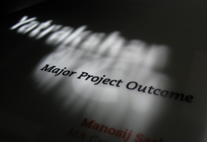
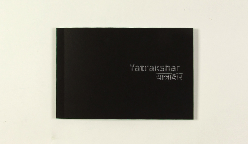
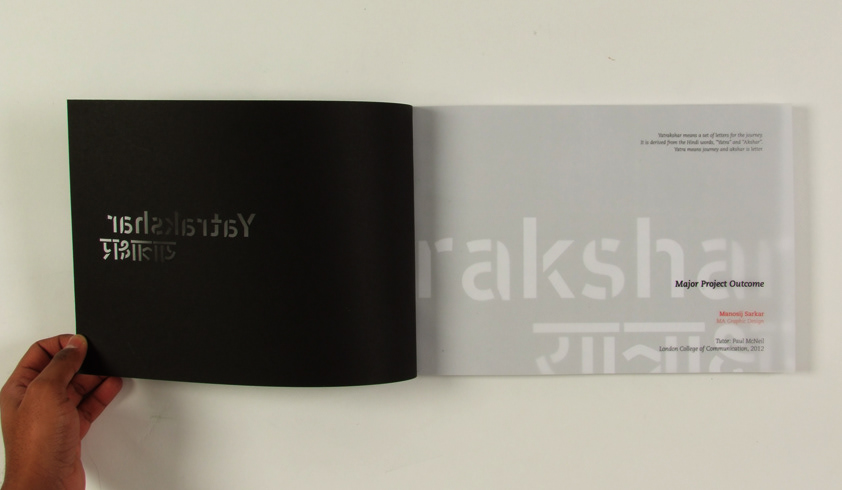
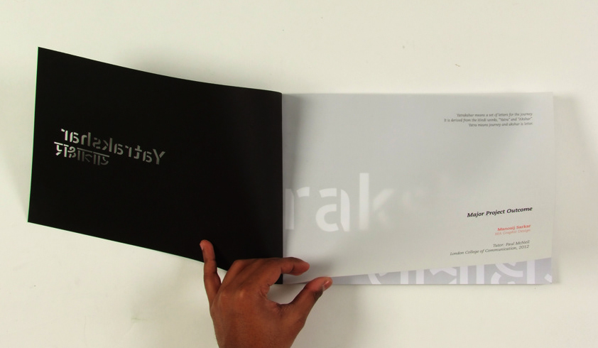
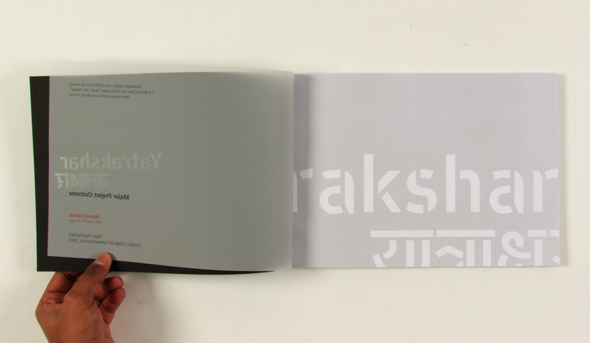
Yatrakshar means a set of letters for the journey.
It is derived from the Hindi words, “Yatra” and “Akshar”.
Yatra means journey and akshar is letter.
Yatra means journey and akshar is letter.

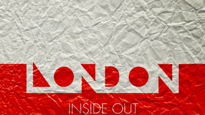
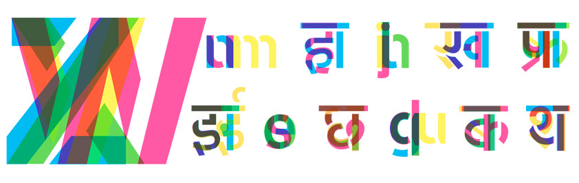
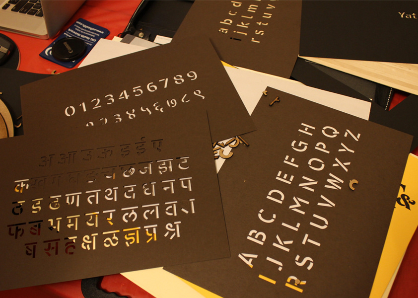
Yatrakshar is a prototype of a set of bilingual stenciled typeface for the transport system in Maharashtra (a state in western side of India). It supports Latin and Devanagari script. Maharashtra being a state with Marathi as its regional language which is written in the Devanagari script, the typeface cover the three main languages that are used here; English, Hindi and Marathi.
The main goal of the project is to find a definite solution to standardize the random, vernacular and multilingual typography that are used in transport system in Maharashtra. The places which tend to use hand painted signs in the transport system because of the lack of required technology, poor financial condition and lack of proper design awareness can use the stencil. It can be used as a digital typeface and also as a physical stencil depending on the requirement. The aim was also to come up with a typeface that can carry a certain flavor for the place and work as an identity for Mumbai & Maharashtra.
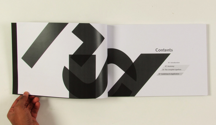
The project has been divided into two parts; the first part consists of developing the prototype of the bilingual typeface. And the second part has the execution and use of the typeface as a brand through various means of transport along with a short brand manual.

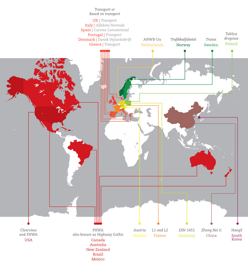
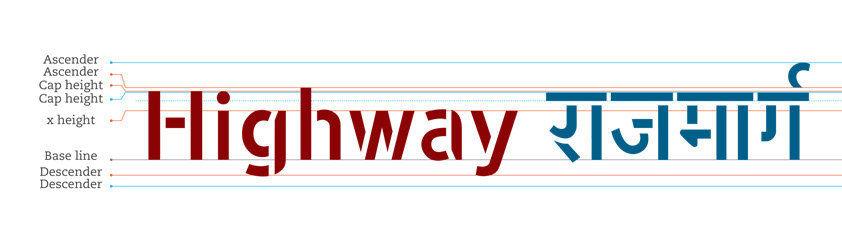
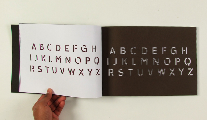
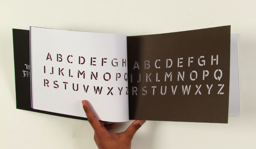
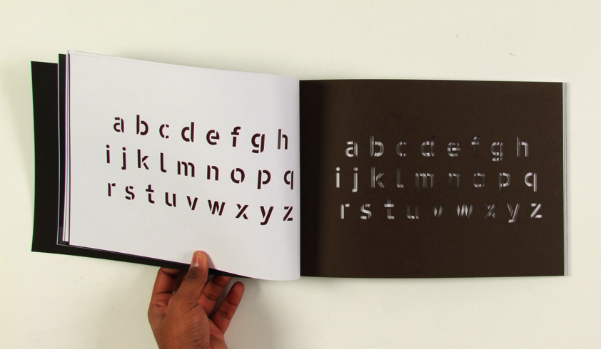
The Latin typeface of Yatrakshar has been developed from the widely used “Transport” typeface designed by Margaret Calvert and Jock Kinneir. The main reason to pick Transport as the basic typeface is this is the most used typeface in transport system and also been developed further into other typefaces for transport system in many countries.
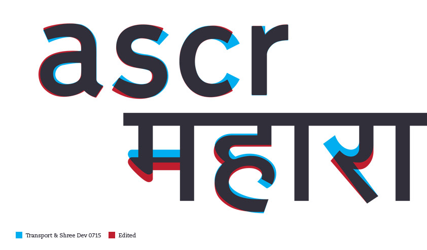
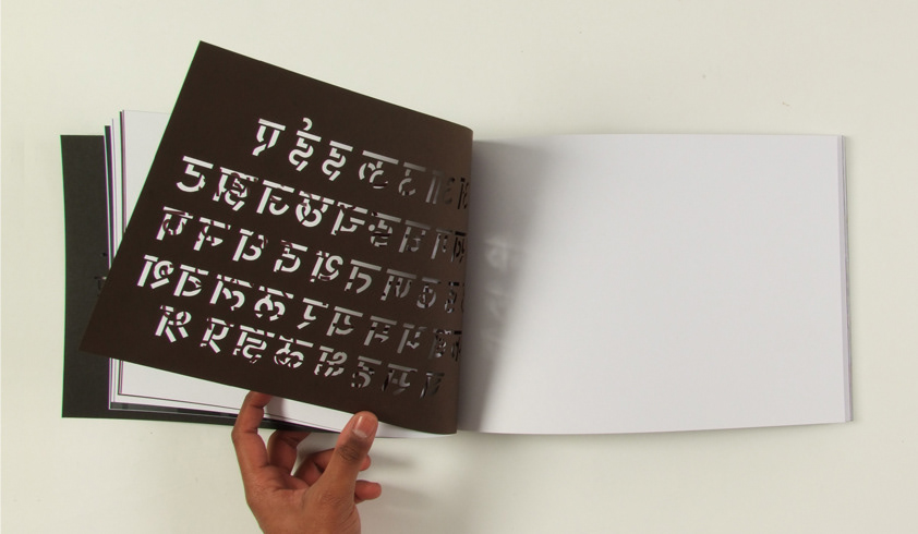
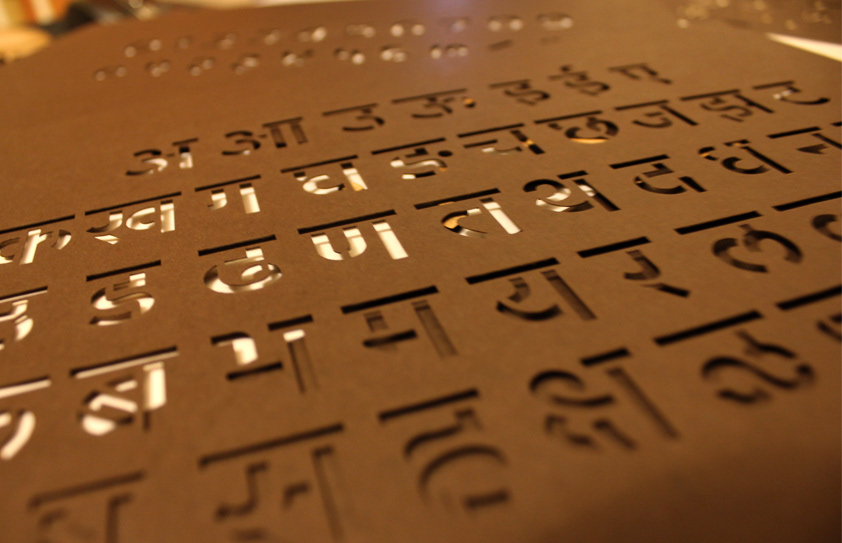
The Devanagari typeface has been developed on “Shree Dev 0715”. Although there is no specific typeface for transport system in Devanagari, Shree Dev 0715 was more close to the transport visually.It was developed further to make it more legible.
The intention was to make the stencil very easy to use and also make it as legible as possible. Legibility becomes the most critical issue when working on the typeface for transport system and stenciled letters generally are less legible than non-stenciled. So the challenge in keeping a balance between the usability and legibility is a major aspect of the project.
The intention was to make the stencil very easy to use and also make it as legible as possible. Legibility becomes the most critical issue when working on the typeface for transport system and stenciled letters generally are less legible than non-stenciled. So the challenge in keeping a balance between the usability and legibility is a major aspect of the project.


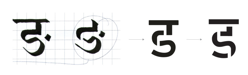
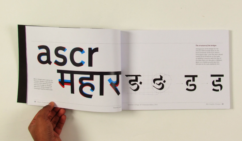
Arrangement of the bridges for the stencil is been broadly based on the hand movement of the hand written Devanagari script. Later they were placed evenly on the letterform on the basis of usability. It matches with the flow of the letter form and also gives a different flavor to it. Similar process was then followed on the Latin alphabets also.
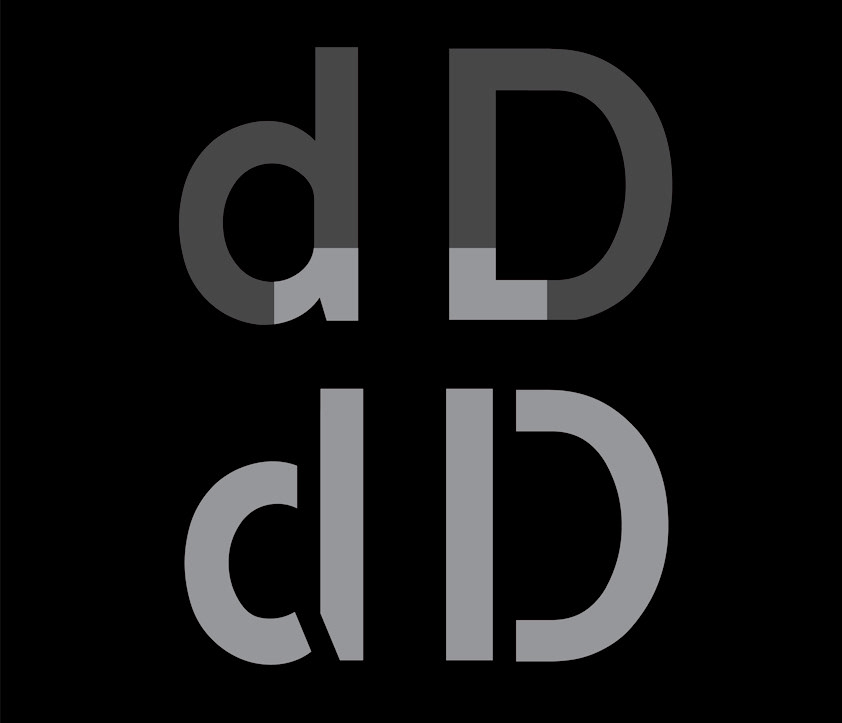
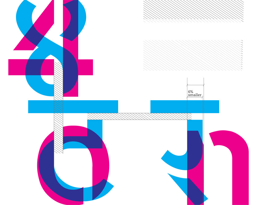
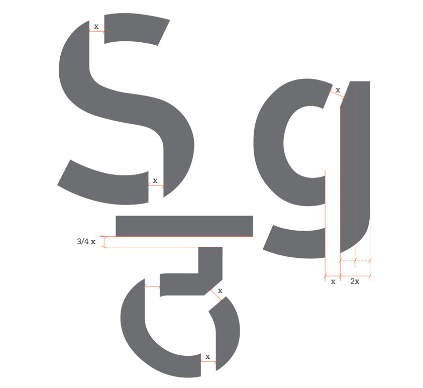
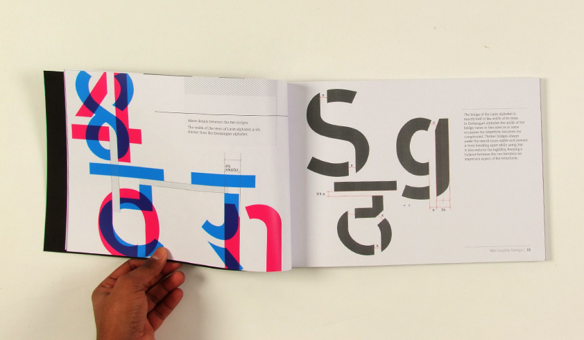
The bridge of the Latin alphabet is exactly half of the width of its stem. In Devanagari alphabet the width of the bridge varies in two sizes as in some occasions the letterform becomes too complicated. Thicker bridges always make the stencil more stable and prevent it from breaking apart while using, but it also reduces the legibility. Keeping a balance between the two becomes an important aspect of the letterform.

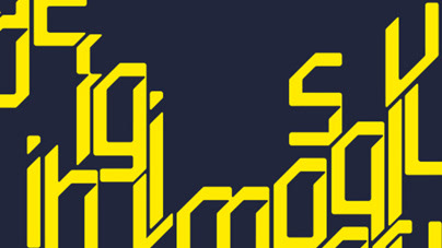
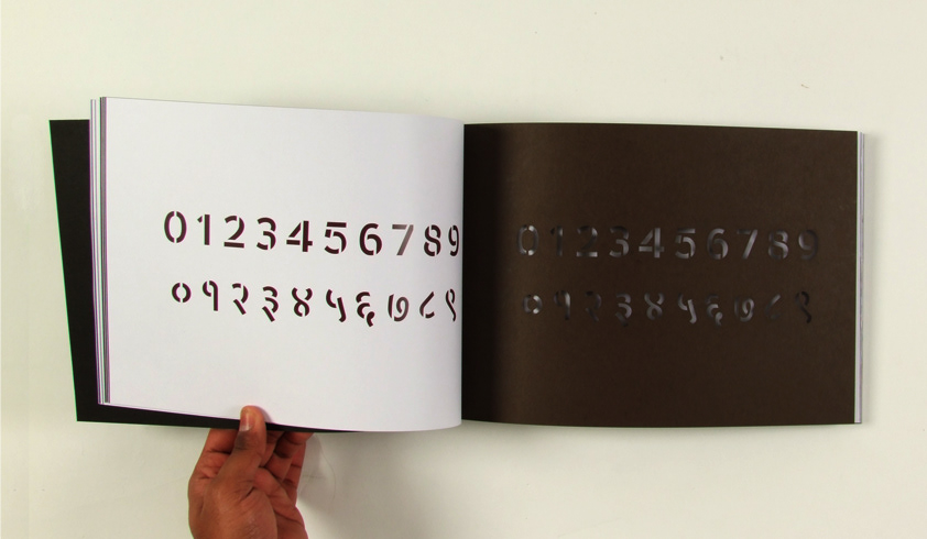
The relation between the basic letterforms and their stenciled versions in both scripts. It also features the minor changes in the letterform that comes after applying the bridges.

The final prototype


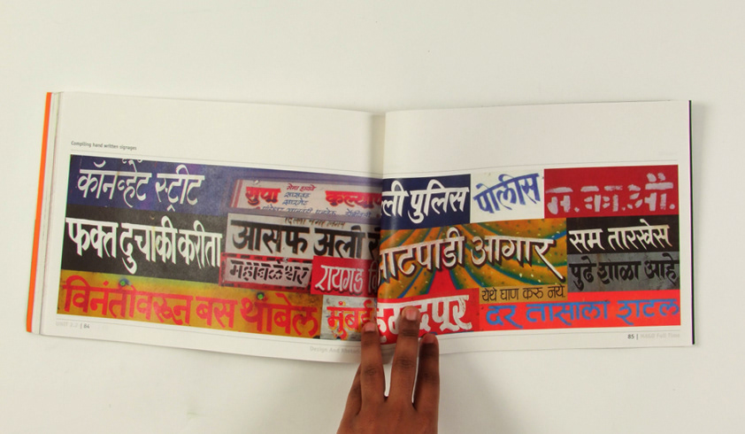
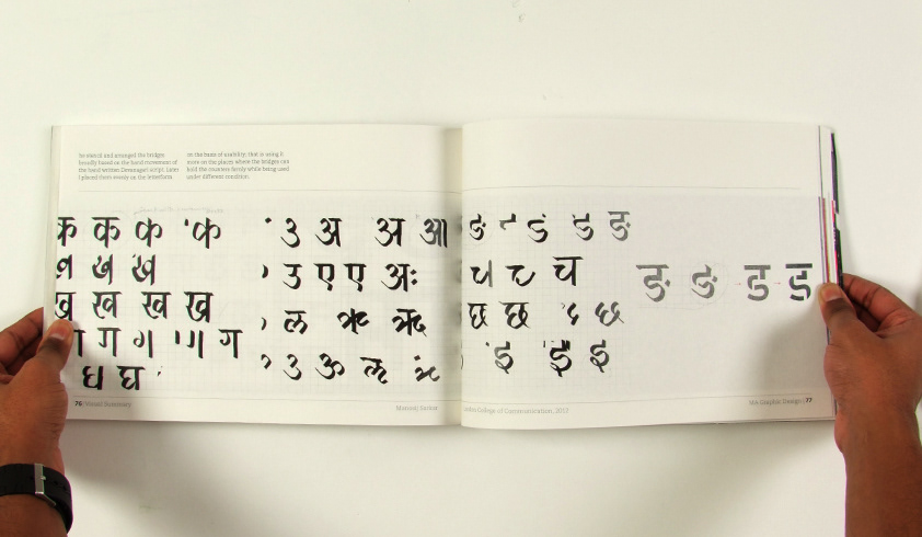
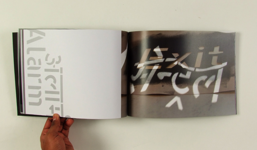
A few pages from the final book.


The complare research is available in the following links